Why the Right Format Matters in Mobile-First Content
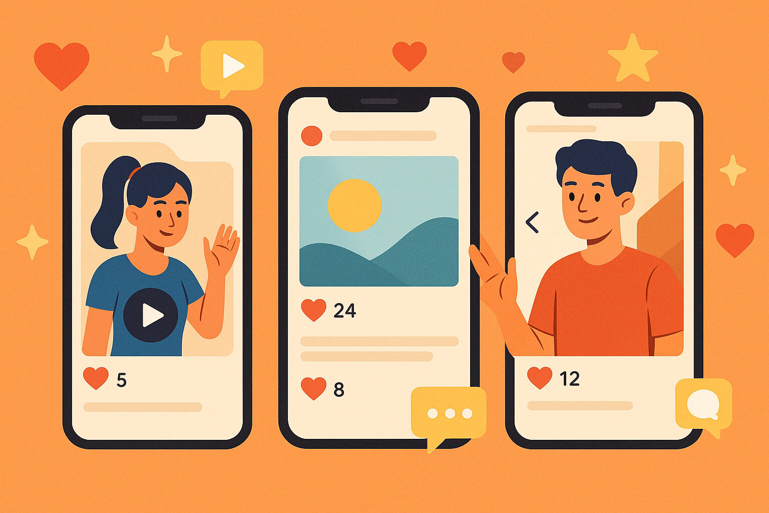
In an age where nearly everyone scrolls through social media on their phones, simply posting any content isn’t enough. The format of a post greatly affects how well it connects with an audience. Brands, creators, and businesses need to adapt to this mobile behavior to make their messages stand out.
When content isn’t optimized for mobile, it often gets ignored—it may appear too small, hard to read, or slow to load. With so much competition in the news feed, the first few seconds are critical. That means the size, length, and style of the format must suit small screens.
Proper formatting isn’t just about technical performance—it also enhances storytelling. A short but impactful video or carousel post can tell a better story than a lengthy desktop caption. That’s why understanding which formats thrive in a mobile-first environment is essential.
Vertical Video: A Viewer Favorite
One of the most effective formats is vertical video. Given how smartphones are used, scrolling vertically feels more natural for users. Vertical videos also take up the full screen, offering a more immersive experience.
Platforms like TikTok, Instagram Reels, and YouTube Shorts showcase the power of vertical content. Creators can easily hit millions of views in just 15–30 seconds with these formats. They allow for fast-paced storytelling, perfect for short attention spans on mobile.
Expensive gear isn’t required—just a smartphone will do. As long as the message is clear and editing is solid, the video can go viral. Adding captions or text overlays also helps viewers understand even when watching with sound off.
Square Format for Consistency
In addition to vertical, square format remains effective, especially on Instagram and Facebook. Square posts display well whether the phone is in portrait or landscape mode, making content easy to consume.
This format works great for an infographic, quotes, product shots, and carousel posts. Its visual balance makes it eye-pleasing and easy to follow. In feeds, square images stand out more than narrow rectangular ones that may feel incomplete.
For example, food or product brands use square carousels to highlight different product features slide-by-slide. It’s easy to follow the story and include more detail without appearing cluttered.
Text-Based Content with Strong Visual Appeal
Not all mobile-first content needs video or images. Sometimes, text alone can make an impact—if presented visually. This involves the right typography, colors, and layout.
A short motivational quote in bold font with a vibrant background can catch attention instantly. On mobile, if the design is simple and clean, users are more likely to screenshot, share, or save it.
Many Instagram or Threads pages rely solely on text visuals and still generate high engagement. This is thanks to a consistent aesthetic, relatable messages, and instant readability. Words can be powerful if visually packaged for small screens.
Stories: Short-Lived Content with Big Impact
The Stories format is a key part of any mobile-first strategy. These are vertical, 15-second posts that disappear after 24 hours. This time limit pushes creators to keep posts fast, clear, and engaging.
Stories are used for behind-the-scenes clips, promotions, quick updates, and polls. Viewers often engage more because of their temporary nature. Since they vanish quickly, there’s a sense of urgency to watch them.
For brands, Stories offer a chance to connect casually with followers. Interactive stickers like Q&A and polls make communication more dynamic and engaging.
Carousel Posts That Tell a Story
Carousel formats are perfect for sharing step-by-step content or sequential details. Popular on Instagram, they let users swipe through multiple images or graphics.
This is useful for tutorials, informational series, or mini-stories. For example, a fitness coach might show a five-slide workout plan from warm-up to cool down.
Since it only requires swiping, carousels are easier to follow on mobile than long captions. Each slide acts as a piece of the story, and if the flow is good, viewers spend more time on the post.
Live Video for Real-Time Interaction
Live streaming delivers a unique experience for mobile users. It’s spontaneous, real-time, and exciting. Platforms like Facebook, Instagram, and TikTok often send notifications for live videos, increasing visibility.
An online store could use live video to demo new products, answer viewer questions, or offer exclusive deals. Artists and educators also use it to teach or casually chat with their audience.
In mobile settings, the key is simplicity and clarity. Fancy setups aren’t necessary—clear audio and decent video quality are what matter. Authenticity resonates more than high production value.
GIFs and Animated Posts for Quick Reactions
Sometimes quick motion captures attention better. That’s where GIFs and simple animations shine. In just a few seconds, a GIF can deliver a message, make someone laugh, or provide context.
Brands use animated posts for announcements, countdowns, or product highlights. On TikTok and in Stories, these make the feed more dynamic and engaging.
The key is to avoid overly fast or chaotic movement. The animation should align with the visual style of the page. When colors, fonts, and tone are consistent, they blend naturally into the brand identity.
Silent Videos with Captions
Many users watch videos with their phones on mute. That’s why adding captions is one of the most important practices in mobile-first content. It’s not just an accessibility feature—it keeps people engaged.
A 30-second product tutorial becomes more effective with clear on-screen text. This ensures the message is understood even without sound.
Some creators use subtitles on all their content, not just documentaries. This shows they understand their audience’s habits and offer flexibility in how content is consumed.
Format Consistency Drives Results
Using a good format once isn’t enough. Consistency in content formatting is a key ingredient to mobile success. When every post shares a similar layout, size, and style, audiences quickly recognize the creator or brand identity.
For example, a page that always uses pastel colors, clean fonts, and square layouts becomes memorable. Even without seeing the name, people can tell who the content belongs to.
Consistency isn’t just about looks. It includes tone of voice, animation pacing, and call-to-action style. These elements strengthen brand-audience relationships over time.
Easy to Remember, Easy to Engage
The best formats are those that are easy to consume, share, and remember. In a sea of online content, simple layouts, clear messages, and good timing are more effective than overly complex designs.
When a post fits the screen, is easy on the eyes, and simple to navigate, it’s more likely to engage users. Attention spans are short on social media, so clarity and quick readability give content an edge.
Creators, marketers, and brand managers benefit from continuously testing different formats. But in the end, what matters most is how well the format responds to the needs of their mobile audience.


No responses yet