How Heatmaps Help Build Smarter Content Strategy
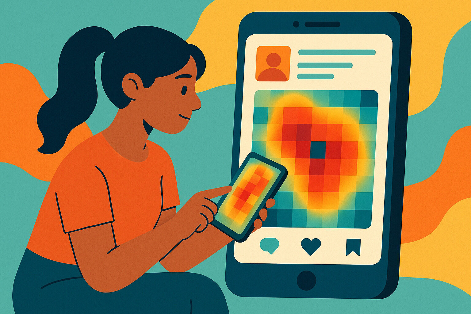
When creating content for social media, it’s not enough to just post every day. The real question is: how do you know if your post is effective? This is where heatmaps come in—a visual tool that shows how users truly interact with your content. It’s not guesswork; it’s based on actual eye and finger movement data from your audience.
Heatmaps typically use color to indicate which parts of a post, page, or ad get the most attention or clicks. Red highlights areas with the highest engagement, while blue indicates the least. On social media, heatmaps reveal which parts of a video are replayed, which buttons are most clicked, and which elements are mostly ignored.
With this kind of visual data, every content strategy becomes more informed. You’re no longer relying on gut feel. Now you know exactly where to place your call-to-action, which headlines work, and whether the product image is better placed at the top or middle of the screen.
Better Understanding of Viewer Focus
One of the main benefits of heatmaps is their ability to show where a user’s eyes go in the first three seconds. In the fast-paced world of social media scrolling, first impressions are everything. Heatmap data shows whether users immediately see your brand logo, headline, or call-to-action.
Sometimes, despite high-quality graphics or a clear message, elements get missed because they’re in the wrong place. Heatmaps reveal if the center of an image gets more attention than the bottom. If you see that your button isn’t in the user’s line of sight, you can adjust its placement.
This insight isn’t just for large companies. Solo creators and small businesses can benefit too. If you notice viewers tend to focus on faces, it may be worth adding more human elements to your content.
Adjusting Layout Based on Real-Time Behavior
The layout of a post greatly impacts engagement. But often it’s hard to judge which layout is most effective. Heatmaps bridge the gap between design and actual viewer behavior. This allows you to adjust your format based on results—not guesses.
For instance, in an Instagram carousel, a heatmap can show which slide gets the most views or scrolls. If most users stop at the first two slides, place your most important message there.
You don’t always need the most creative or innovative design. Sometimes, the simplest and most readable layout performs best. But you wouldn’t discover that without tools like heatmaps. This leads to clearer, more immediate audience impact.
Understanding User Intent Through Movement Patterns
Every user action—scrolling, clicking, or pausing—means something. Heatmaps don’t just show where users look, but how they behave in those few seconds. This helps you understand what they’re really searching for, or why they stay or leave.
For example, in Facebook ads, if many users click the image but not the link, it could mean the image is more attention-grabbing than the message. Or perhaps it’s unclear where to click, reducing conversions.
Movement patterns reveal whether a viewer is focused or distracted. If there’s strong interaction in one area, that element has potential to be expanded—maybe into a series, more variations, or an ad.
Enhanced Content Testing with Visual Data
Content testing is essential but often difficult to measure. Typically, you rely on likes and comments. With heatmaps, you get deeper analysis. It’s not just numbers—it’s visual cues showing how content performs from a viewer’s perspective.
If you test two versions of a post—one with a large headline and another with a minimalist layout—heatmaps reveal which version gets better engagement in key areas. You don’t have to wait for shares or saves. Within minutes, you get feedback on what works.
This is especially helpful for A/B testing. With the same message but different visuals, heatmaps clearly show which is more effective. This saves ad budgets and creation time on underperforming content.
Identifying Weak Content Areas
Not all parts of a post perform equally. Some elements are overlooked, which may be why engagement is low. Heatmaps help identify which parts of your content are being ignored.
For example, the footer in a TikTok caption might contain a crucial hashtag or link. But if that section always shows “cold” on the heatmap, you might need to change the format or wording. You wouldn’t know this just from likes or comments.
Every weak spot found is an opportunity for improvement. You don’t need a total overhaul—small tweaks in color, font size, or positioning can make more people notice that section.
Improving the Mobile User Experience
Most social media users are on mobile phones. Heatmaps provide valuable insights into how users interact with smaller screens. Mobile behavior differs from desktop, so understanding both is crucial.
With mobile heatmaps, you’ll see which part of a vertical post has the most retention. If users focus on the middle of a video but quickly scroll past the end, maybe the content needs to be shorter or faster-paced.
A smooth mobile experience increases chances for interaction. Layout and spacing tailored for mobile viewing aren’t just technical tweaks—they’re about caring for your audience.
Applying Heatmaps to Story Formats
Heatmaps aren’t just for static posts. They work for stories, reels, and shorts too. Some platforms offer analytics showing how long users paused on each frame or which stickers or polls got the most clicks.
In Instagram stories, for example, if the first slide gets the most views and only half reach the end, it’s a sign to put your most important message early in the sequence.
This data isn’t always obvious, but with heatmaps, user behavior becomes clear. It’s not just about engagement metrics—it’s about real human interaction with every second of your content.
Real-Time Adjustments for More Effective Campaigns
Sometimes, content needs quick adjustments. During a product launch or live event, you can’t wait days for results. Heatmaps offer visual feedback immediately—so you know if you need to change your ad, caption, or layout right away.
For instance, if your CTA button isn’t getting attention on day one of a campaign, move it to a more visible spot. You don’t need to wait for deep data analysis—heatmap visuals drive fast, practical decisions.
Agility is a major advantage in social media. With real data like heatmaps, you stop guessing. You act based on real user behavior.
Deeper Audience Connection Through Visual Clarity
Ultimately, heatmaps aren’t just about numbers. They help you form a deeper connection with your audience. When you understand how people look, move, and decide, it’s easier to communicate in a way they truly get.
A beautiful design is not enough. The real question is: Did they see it? Did they click it? Did they finish watching the video? Heatmaps answer these questions. And with those answers, your content gets sharper every time.
With every adjustment, test, and lesson from heatmaps, audience trust deepens. You show you understand them—not just who they are, but how they behave.


No responses yet